YELLOWSPARK NOTES / COLOUR-PAIRING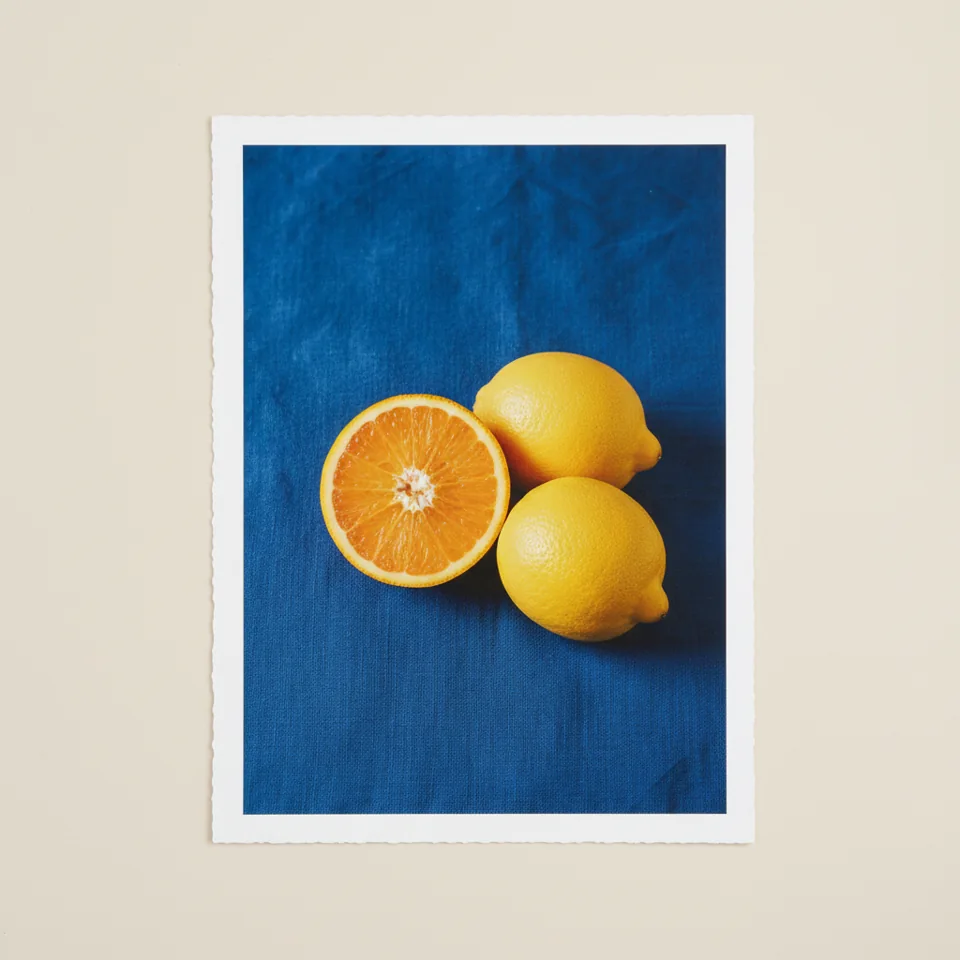
Colours with good company.
Warm meeting cool.
Amber Glass Study and Citrus on Cobalt are a useful starting pair: warm orange connects them, while the blue changes the temperature. Place the images at a shared visual height but do not force every object in the room to repeat their shades.
ButterOrangeCobaltCoralInk
One vivid note, one quiet neighbor.
Primary Still Life carries three strong colors. Warm Sand Layers offers beige and ochre as a softer counterweight. Try one saturated image beside a quieter composition, leaving enough wall between them that each can be read on its own.

Test the light you live with.
Daylight, warm lamps and screen settings can all shift perceived color. Use the images as a composition guide, not as a paint-match sample. Compare your room in the morning and evening; a thoughtful contrast is often more satisfying than a close but imperfect match.
See the complete colour sheet →